

https://parachutefonts.com/typeface/Grand-Gothik
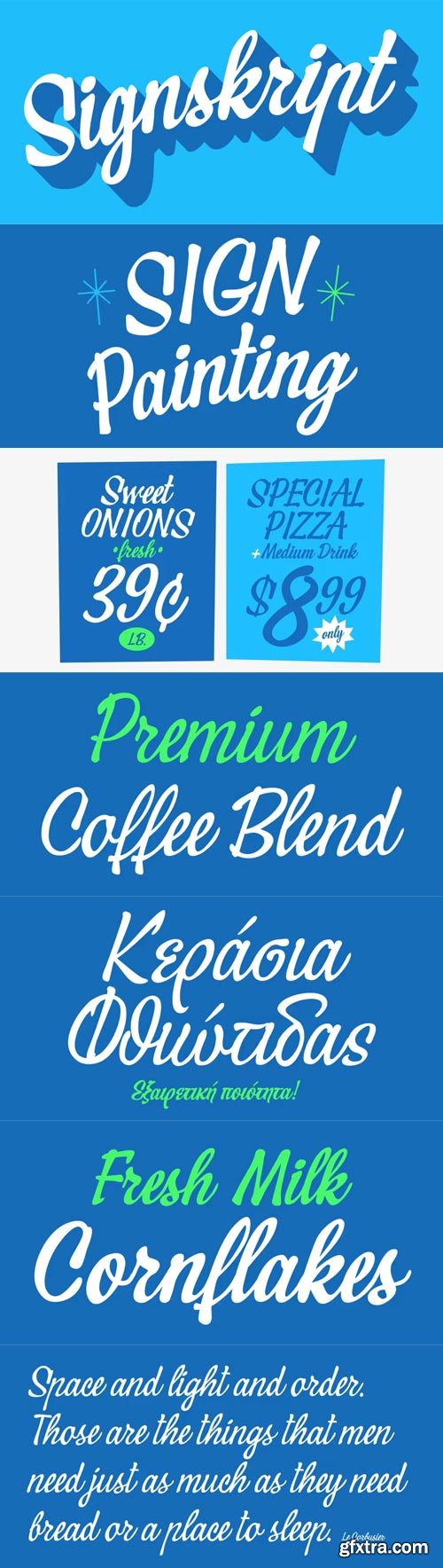
Grand Gothik is a postmodern, multiscript, multifaceted and variable type system which pays homage to the development of grotesque/gothic typefaces over the years. Taking late 19th and early 20th century European and American grotesques as a starting point, it traces this typeface genre up to mid-century movie theater marquees, new wave cinematography, American highway signage and telephone directories, adding some historical references for good measure. Originally designed in 2017 as a bespoke typeface for a bilingual, black and white magazine on surfers, waves and landscapes, it was later reimagined and redesigned leading to the release of its commercial version. The name reflects Grand Gothik’s versatility as a fully functional variable font and its depiction of a vast array of gothic styles found in American and European grotesques. Designed with 3 stylistic alternates, each variation of Grand Gothik depicts a specific period and style: from the less calculated appearance of late 19th century grotesques all the way to their gracefully-shaped contemporary counterparts. The Grand Gothik type system comes with a wide range of styles/weights and supports an extended array of languages and scripts such as Latin, Greek and Cyrillic. Keeping up with the ever-evolving virtual and digital landscape, Grand Gothik comes with an extended character set of weather icons, numeral symbols, wayfinding arrows, movie rating stars and emojis. Also, a Bitcoin symbol was designed as part of its character set in its newly introduced unicode position, rendering Grand Gothik a truly functional modern typeface.
TTF
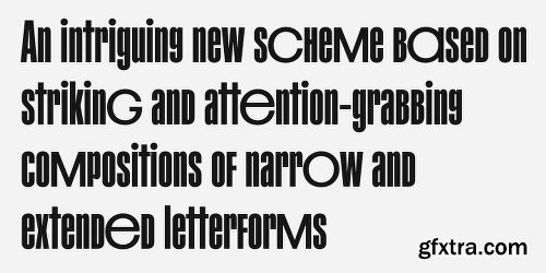
PF Mellon is a modernist variable grotesque with mixed roots.
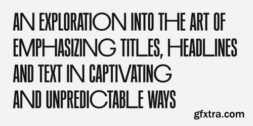
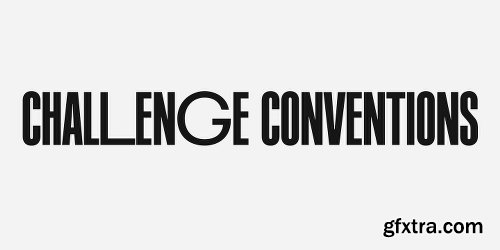
Its unconventional aesthetic is the product of an exploration into the art of emphasizing titles, headlines and text in captivating and unpredictable ways. Contrary to conventional practices of highlighting text with heavier weights, PF Mellon proposes an intriguing new scheme based on striking and attention-grabbing compositions of narrow and extended letterforms- even when set in lowercase. Part geometric and part grotesque, PF Mellon’s expressionist alphabet and extravagant style challenge conventions of visual culture in an Art Deco-like manner.
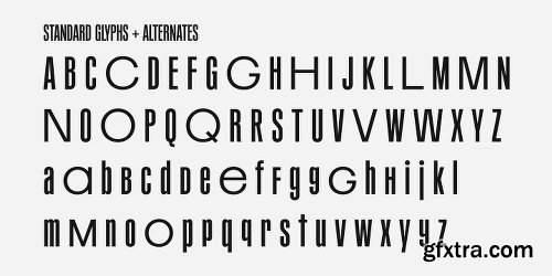
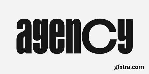
PF Mellon’s rebellious idiosyncrasy takes its cues from the eccentric personality of our popular PF Venue, an earlier geometric sans serif characterized by its daring combinations of non-uniform structures. PF Mellon’s basic design skeleton was influenced by nineteenth and early twentieth century condensed sans serif typefaces such as Stephenson Blake’s Grotesque No.77 and ATF’s Alternate Gothic, adding an extra contrast to the thickness of strokes.
PF Mellon is also available as a variable font format which you may request it free of charge from Parachute® once you purchase the whole type family.
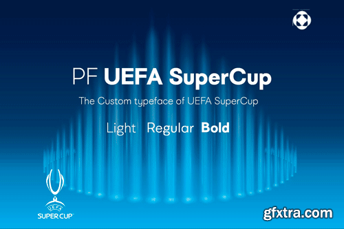
PF UEFA SuperCup - The Custom UEFA Typeface of UEFA SuperCup
Royal, majestic, elegant. These letters are based on Roman and Greek characters carved on stone. They come in 3 different styles. Normal and Shaded are designed to have serifs with a finer thinning. On the other hand, Metallic is bolder and simulates in the most realistic way three-dimensional metallic lettering. There are some alternate characters placed at lowercase positions as well as a few stylistic alternates which are accessed through the OpenType features. Pay attention to letters like Greek Omega (lowercase position) and Greek Xi (lowercase position) as well as B, R, K (lowercase position). Monumenta Pro was recently upgraded to support Latin, Greek and Cyrillic.
OTF + TTF | 3 Fonts | 4.8 Mb RAR
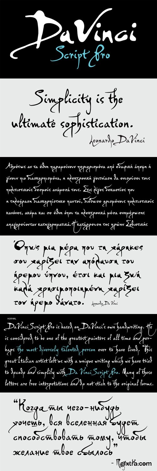
PF DaVinci Script Pro Font Family
PF DaVinci Script Pro is based on DaVinci’s own handwriting. He is considered to be one of the greatest painters of all time and perhaps the most diversely talented person ever to have lived. This great Italian artist left us with a unique writing (used to write from right to left), which we attempted to decode and simplify with PF Da Vinci Script Pro. Many of these letters are free interpretations and do not stick to the original forms. This typeface comes in 2 different styles: Regular and a more informal style called Inked. The all new “Pro” version supports all European languages including Latin, Greek, Greek Polytonic and Cyrillic. It comes loaded with many stylistic alternates in all languages.
TTF | 2 Fonts | JPEG Preview | 4.6 Mb RAR

http://www.myfonts.com/fonts/parachute/pf-diplomat-sans/
A clean humanistic sans-serif typeface which complements its serif version Diplomat Serif. It has preserved several of its original characteristics and comes complete with true-italics with a distinct flowing structure. Supports Latin and Greek.


OTF | WoFF | 45.2 MB
Sale Page]Sale Page[/url]
Bague Inline Pro is the inline version of Bague Universal a contemporary geometric typeface family which blends distinct minimalist characteristics with mainstream details. Despite its inspiration from Herbert Bayer’s drawings of the 1920s, it diverts from the constructivist rigidity and display structure of early geometric typefaces by incorporating humanist characteristics as well as classic letterform shapes which balance out the extremity of the minimal shapes. Bague Inline is a typeface that stays true to its urban nature and heritage.A very interesting feature of Bague Inline is its vast array of uppercase alternates and ligatures which truly shine when set at display sizes. Make your selection from 4 groups of alternates as well as a rich set of discretionary ligatures and watch it transform into a flexible, charming and stylish typeface with strong modern aesthetics. This typeface offers enormous possibilities and variations for editorial design and branding.Bague Inline is the only commercially available inline typeface that comes in 4 weights for uppercase and lowercase letters. Each style consists of 775 glyphs with more that 128 alternates and ligatures and an extended set of characters which supports simultaneously Latin, Cyrillic and Greek.

OTF | WoFF | 48.3 MB
Sale Page
PF Bague Slab Pro draws its inspiration from early 20th century slabs and was designed as a companion to Bague Sans, a versatile monoline typeface with a distinct and eye-catching personality. Following its predecessor’s design guidelines, it overcomes the monotonous and mechanical rigidity of early geometrics by introducing subtle variations in stroke width and semi-wedge serifs rather than square slabs. These striking serifs, along with a mixture of attractive letterforms, exude a strong, modern and energetic personality at display sizes. On the other hand, at small sizes these distinct characteristics become subtle and the simplistic geometric personality of the typeface comes in place to offer a highly readable text.Bague Slab Pro is a very clean and legible typeface with a warm and well-balanced texture which is ideal for editorial design, branding and corporate identity. This superfamily includes 18 weights from Hairline to Ultra Black with a consistent and well-refined structure. The italics are slightly narrower than the romans with cursive characteristics. Each style consists of 718 glyphs with 13 opentype features and an extended set of characters which supports simultaneously Latin, Cyrillic and Greek.
SermonBox - Seasonal Collection

SermonBox - The Series Pack Collection

Top Rated News


Would you like to be a Author?


